UNITY
Brand Strategy & Digital Ecosystem Strategy
As Marketing Director and Brand Strategist, I rebuilt UNITY from the ground up: positioning, content, CRM, automation, and every user touchpoint. I turned cold, unengaged landowners into high-intent leads through a brand that actually worked.
OVERVIEW
Unity Investment Development is a real estate firm that helps home builders and real estate developers by providing land and construction management services.
Up until I stepped in, Unity have't built a strong positioning or a distintive place inside their audience's mind because they had never had a marketing department at all. There was no marketing strategy, no brand positioning, no message that set them apart, no reason for anyone to remember them or choose them over someone else.
They needed to build their own revelant, differentiated brand narrative to reach to their audience without looking or sounding like every other real estate business trying to "buy their land." through a consistent, align and substain communication allowing them to be remember clearly.
And to make it more complex, we weren’t dealing with warm leads. We were reaching out to cold landowners from public records—people who didn’t know us, didn’t ask for us, and weren’t waiting to hear from us. Most assumed we were spam.
The real challenge? Building a brand from zero that could earn trust instantly. That could break through indifference and feel credible, human, and relevant from the very first unsolicited message.
THE MARKET PROBLEM
THE MARKET PROBLEM
THE MARKET PROBLEM
To create something that truly helps people, I had to start by understanding what was broken in the real estate world.
The truth is, it felt like a mess. Most people who owned land were lost. They didn’t know how to sell, what their land was worth, or who to trust. They kept getting confusing letters and low offers in the mail. It felt shady and stressful.
That’s when I saw the real problem.
It wasn’t just about the offer. It was about the experience. No one was making it simple. No one was guiding them. So I decided to fix that.
INSIGHT
INSIGHT
INSIGHT
The industry had forgotten that selling a home is one of the most emotional decisions someone makes. It’s not about square meters, it’s about starting a life. Yet the entire user experience was detached, transactional, and sterile.
So the brand needed to become the opposite of that: relatable, transparent, emotionally intelligent and obsessively user-centered.
BUILDING A REAL BRAND
BUILDING A REAL BRAND
BUILDING A REAL BRAND
Once I understood the real problem: people feeling confused, stressed, and unsure who to trust, I knew we had to be different. The brand needed to mean something. Not just another company buying land. It had to feel human. Helpful. Trustworthy.
So I built a solution that’s clear, honest, and easy.
The brand helps landowners understand their options, get answers, and feel confident about selling. We don’t pressure anyone. We guide them, step by step, in a way that makes sense.
No confusing process. No sales talk. Just real help from real people.

BRAND POSITIONING
BRAND POSITIONING
BRAND POSITIONING
Unity’s positioning is simple: we’re the honest, friendly expert. In a market full of noise, fake urgency, and vague offers, we’re the ones who show up like a real friend, no pressure, no sugarcoating. Just the truth.
Because that’s what people actually want. To feel safe, respected, and in control. We tell it like it is, even if it’s not what they hoped to hear, it’s what they need to make the right call.
That’s how we earn trust. That’s how we stand out.


CHANGING THE NAME
CHANGING THE NAME
CHANGING THE NAME
Unity Development Investments was the primary brand and legal entity of the company for the past 20 years. At some point, the decision was made to simplify the name by dropping 'Development' and renaming it to 'Unity Investments'.
So, the first step in the rebranding process was to streamline further to just 'UNITY'. This name conveys the idea of coming together, which is ultimately what we are trying to represent. So that's why I decided to keep it just 'UNITY'. a more simpler, direct and memorable name.

THE LOGO
THE LOGO
THE LOGO
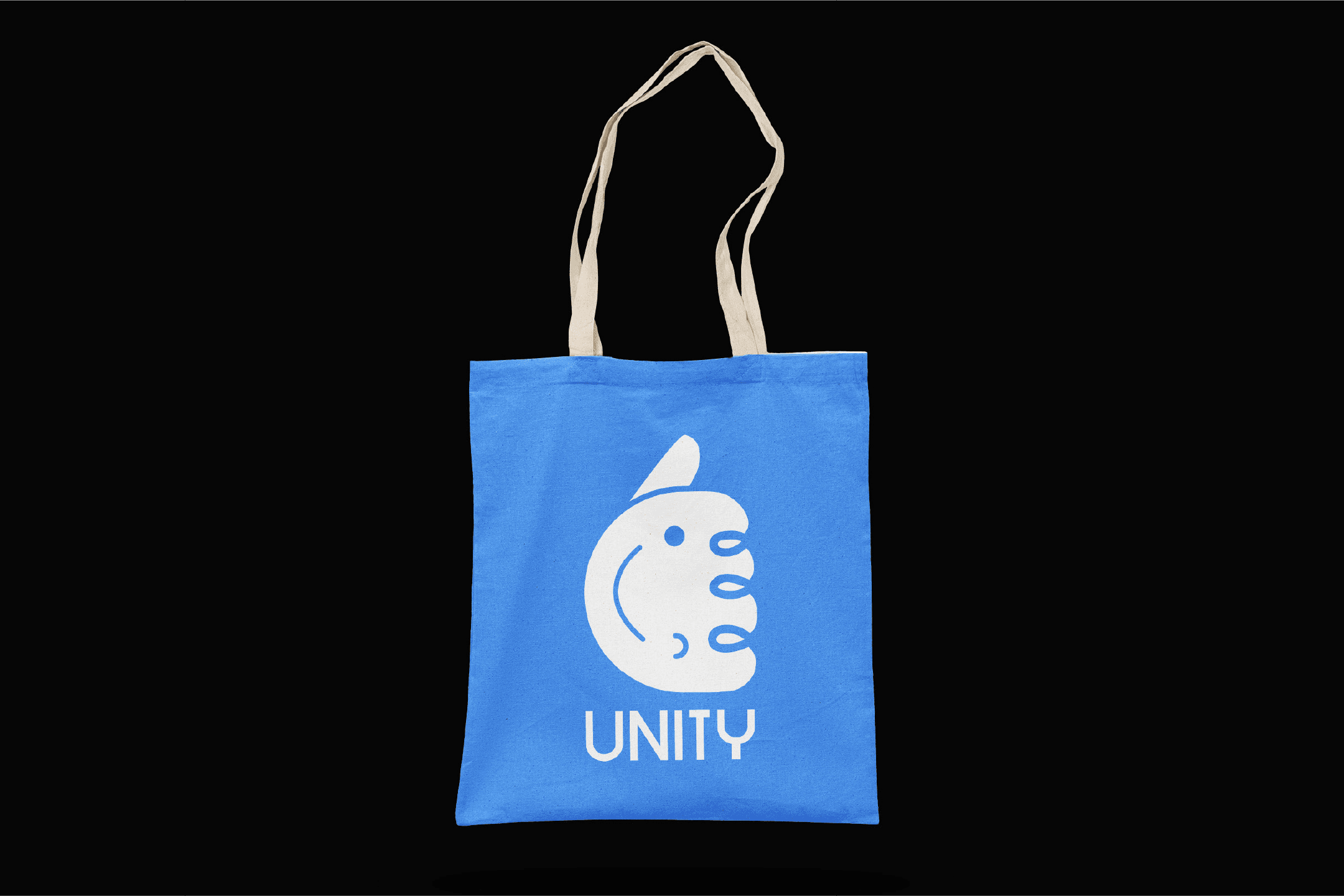
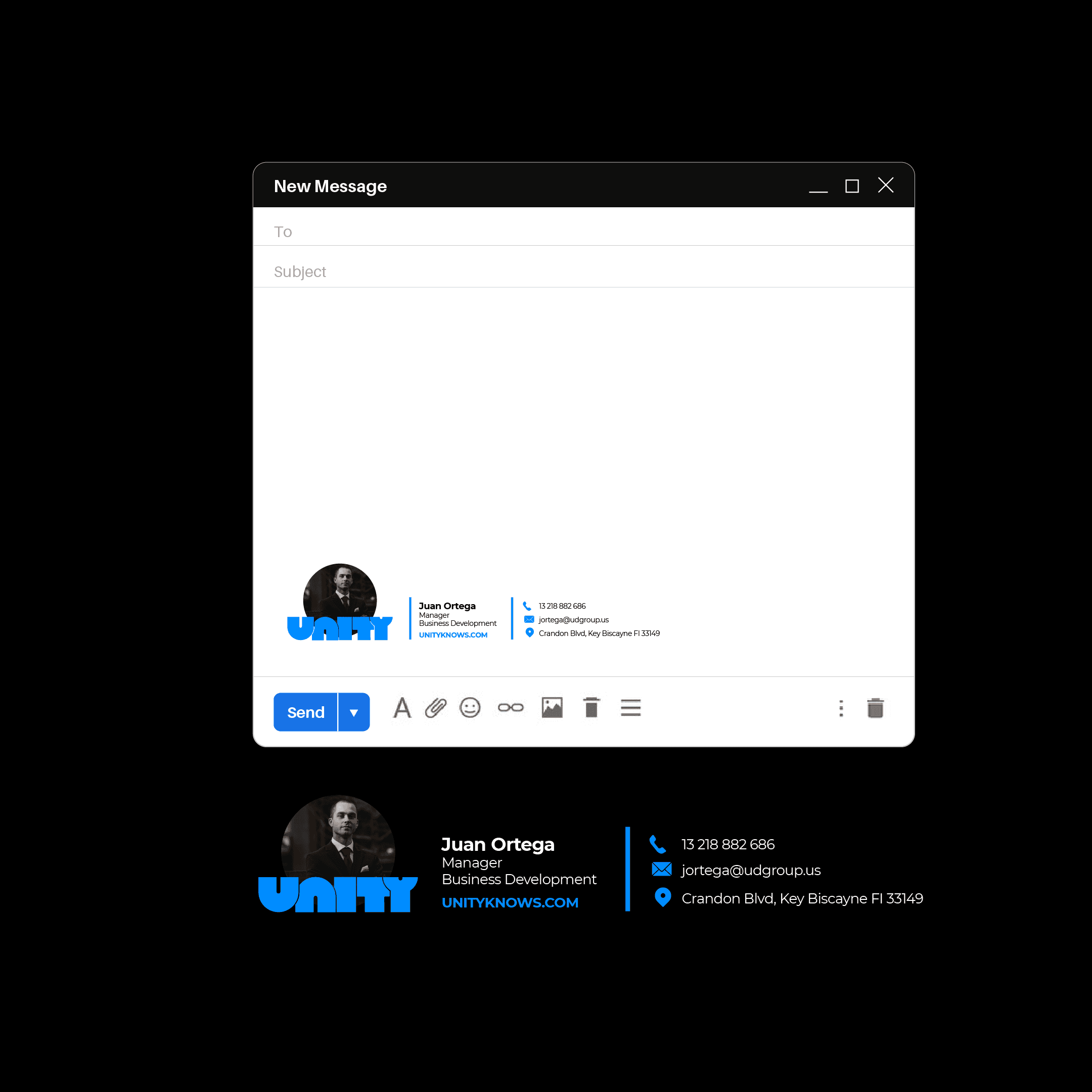
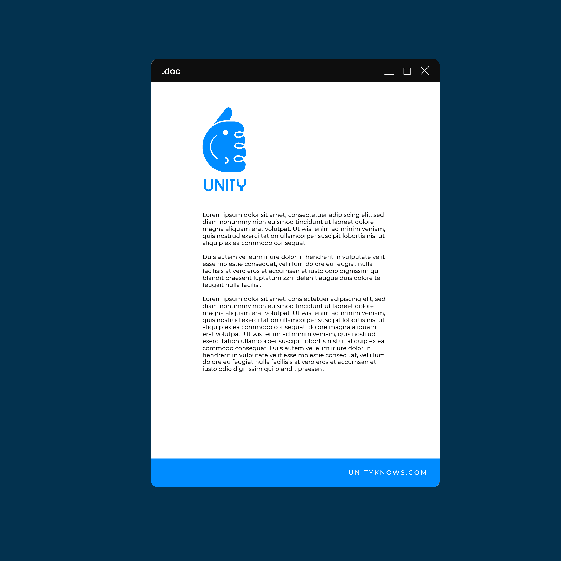
UNITY's logo needed to encapsulate everything we aimed to represent. It had to be warm, friendly, and make a bold statement, which the final design successfully achieves. Reflecting the brand's core concept of coming together, the logo cleverly intertwines the letters, suggesting unity and coherence. The choice of a thick, sans-serif, and rounded typography further conveys warmth and friendliness, while also making the bold statement we desired.
UNITY's logo needed to encapsulate everything we aimed to represent. It had to be warm, friendly, and make a bold statement, which the final design successfully achieves. Reflecting the brand's core concept of coming together, the logo cleverly intertwines the letters, suggesting unity and coherence. The choice of a thick, sans-serif, and rounded typography further conveys warmth and friendliness, while also making the bold statement we desired.
UNITY's logo needed to encapsulate everything we aimed to represent. It had to be warm, friendly, and make a bold statement, which the final design successfully achieves. Reflecting the brand's core concept of coming together, the logo cleverly intertwines the letters, suggesting unity and coherence. The choice of a thick, sans-serif, and rounded typography further conveys warmth and friendliness, while also making the bold statement we desired.

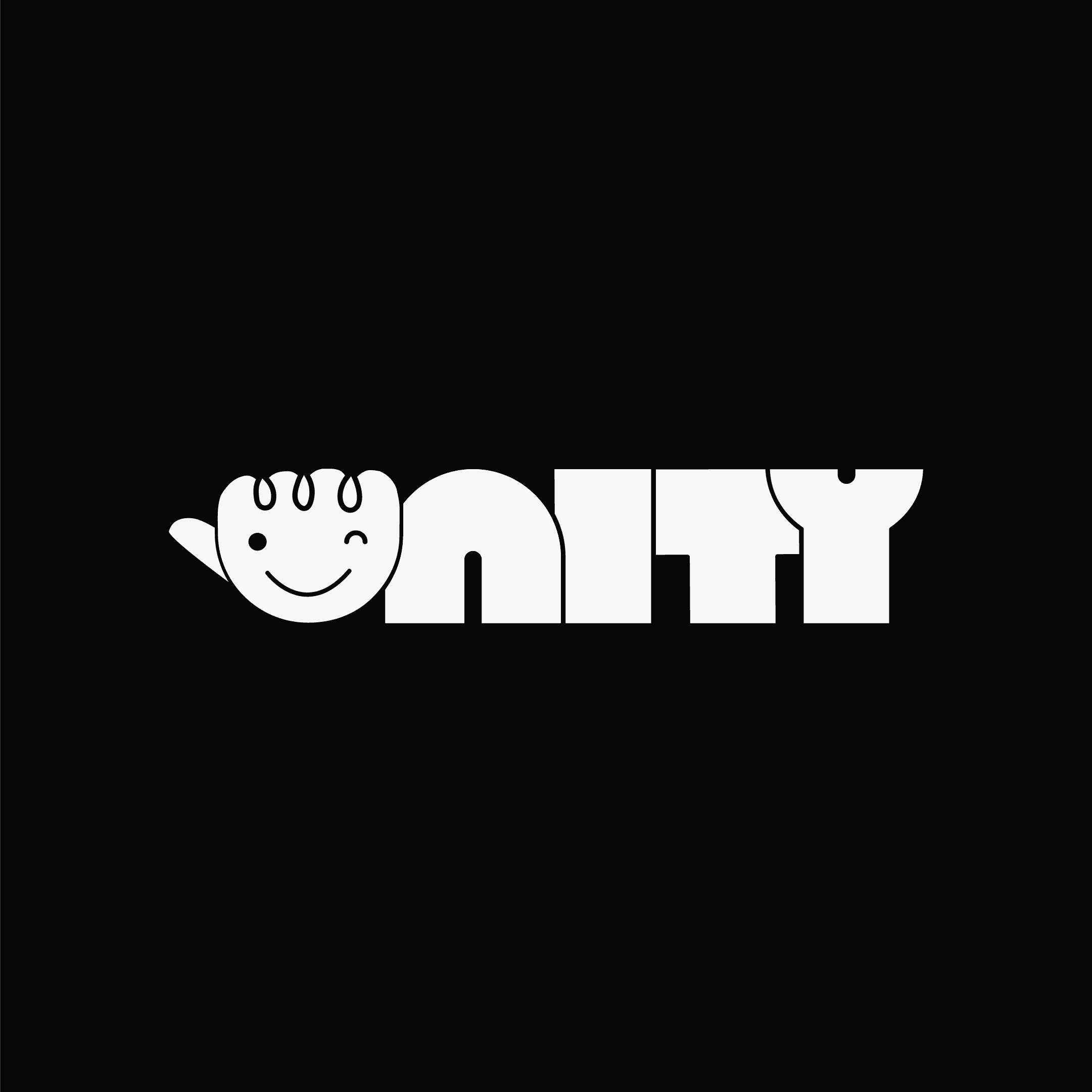
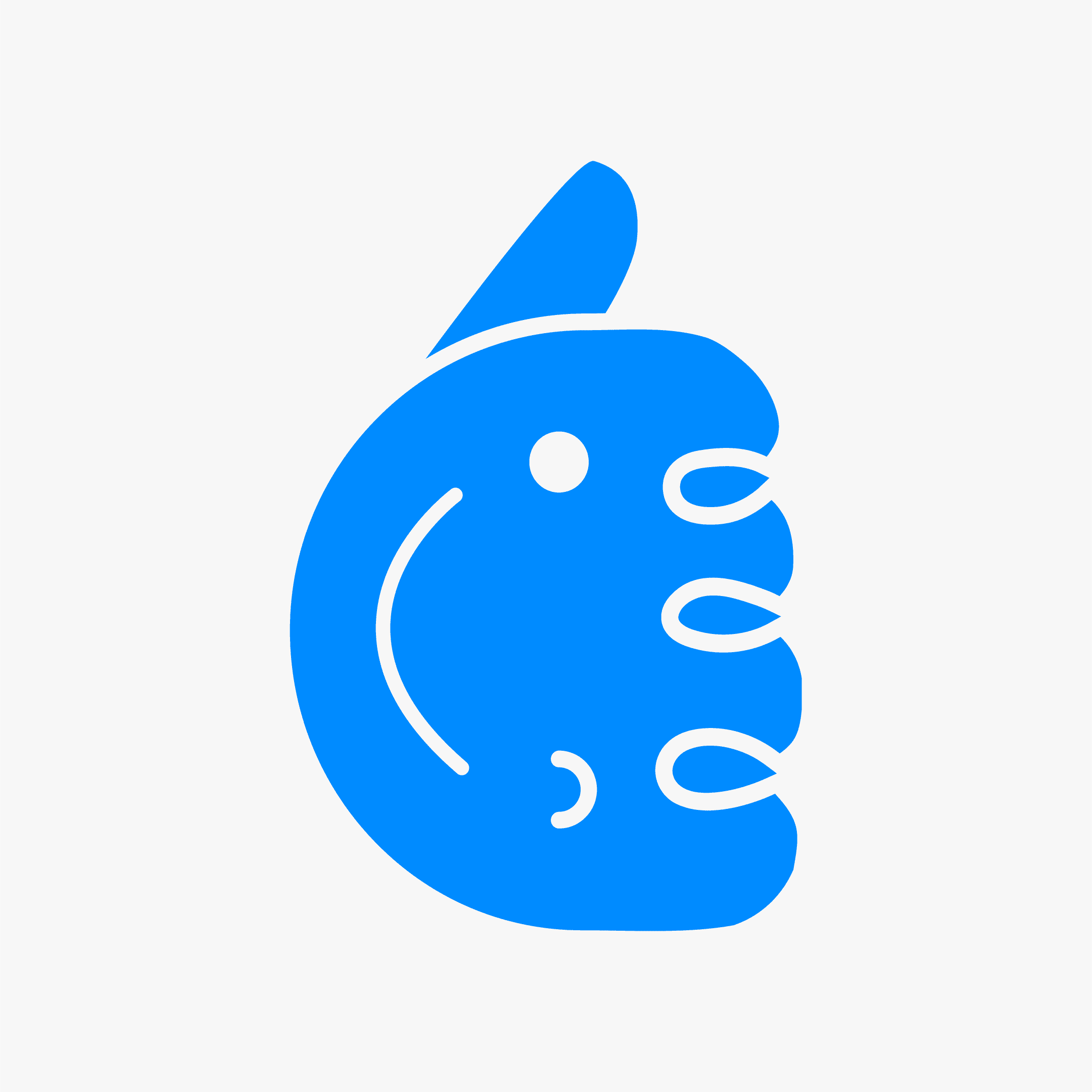
THE ICON
THE ICON
THE ICON
The thumb-up winking icon is an innovative and striking symbol designed to make a lasting impression. This logo represents approval, positivity, and a casual, friendly approach, which are not commonly associated with the traditional and often formal real estate industry. The thumb-up gesture universally conveys a sense of "all is well" or approval, which reassures clients of the quality and reliability of UNITY's services. The addition of the wink adds a layer of personal connection and informality, suggesting that UNITY doesn't just conduct business; it builds relationships.
When consumers see this logo, they are expected to feel a sense of comfort and trust. The friendly and informal nature of the icon is intended to reduce the intimidation often associated with real estate transactions, making UNITY appear more approachable and personable. It communicates that UNITY is a brand that understands the personal stakes involved in real estate decisions and is there to support and guide with a smile, not just provide a service.

ICON VARIATIONS
ICON VARIATIONS
ICON VARIATIONS

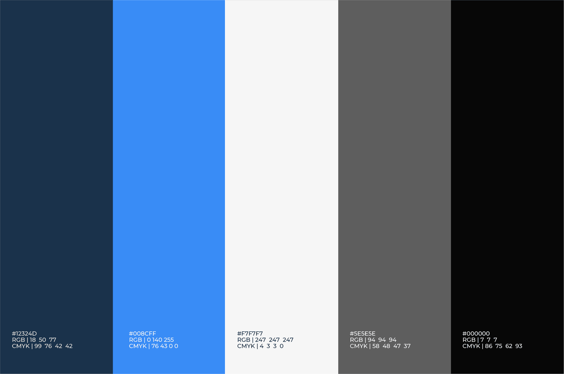
COLOR PALETTE
COLOR PALETTE
COLOR PALETTE
Every shade in UNITY’s palette does more than look good, it speaks. Loud and clear.
Light Blue & Blue: Calm. Clear. Reliable. Light blue brings a sense of ease, what people crave in a space (and in a real estate partner). Deep blue locks in trust and strength. Together, they say: “You’re in good hands.”
White: Transparency isn’t just a value, it’s a visual cue. White keeps things clean, honest, and open. No clutter. No confusion. Just clarity, inside and out.
Gray: Sophisticated and balanced. Gray is the bridge between human warmth and professional confidence. It adds a modern edge while keeping everything grounded.
Black: Authority, depth, timeless energy. Black adds weight to the message: Unity isn’t playing. This is a brand that knows what it’s doing and owns its space.
The result? A color system that mirrors UNITY'S essence: grounded yet aspirational, human yet sharp. Friendly enough to trust. Serious enough to lead.
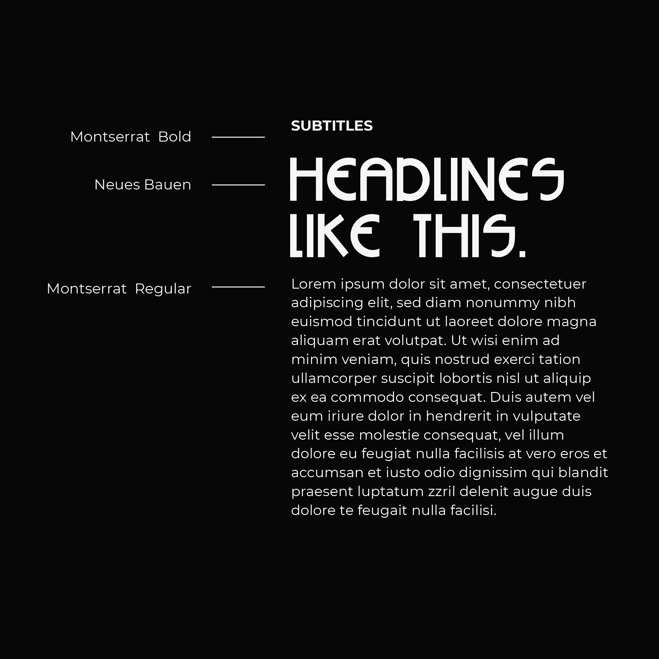
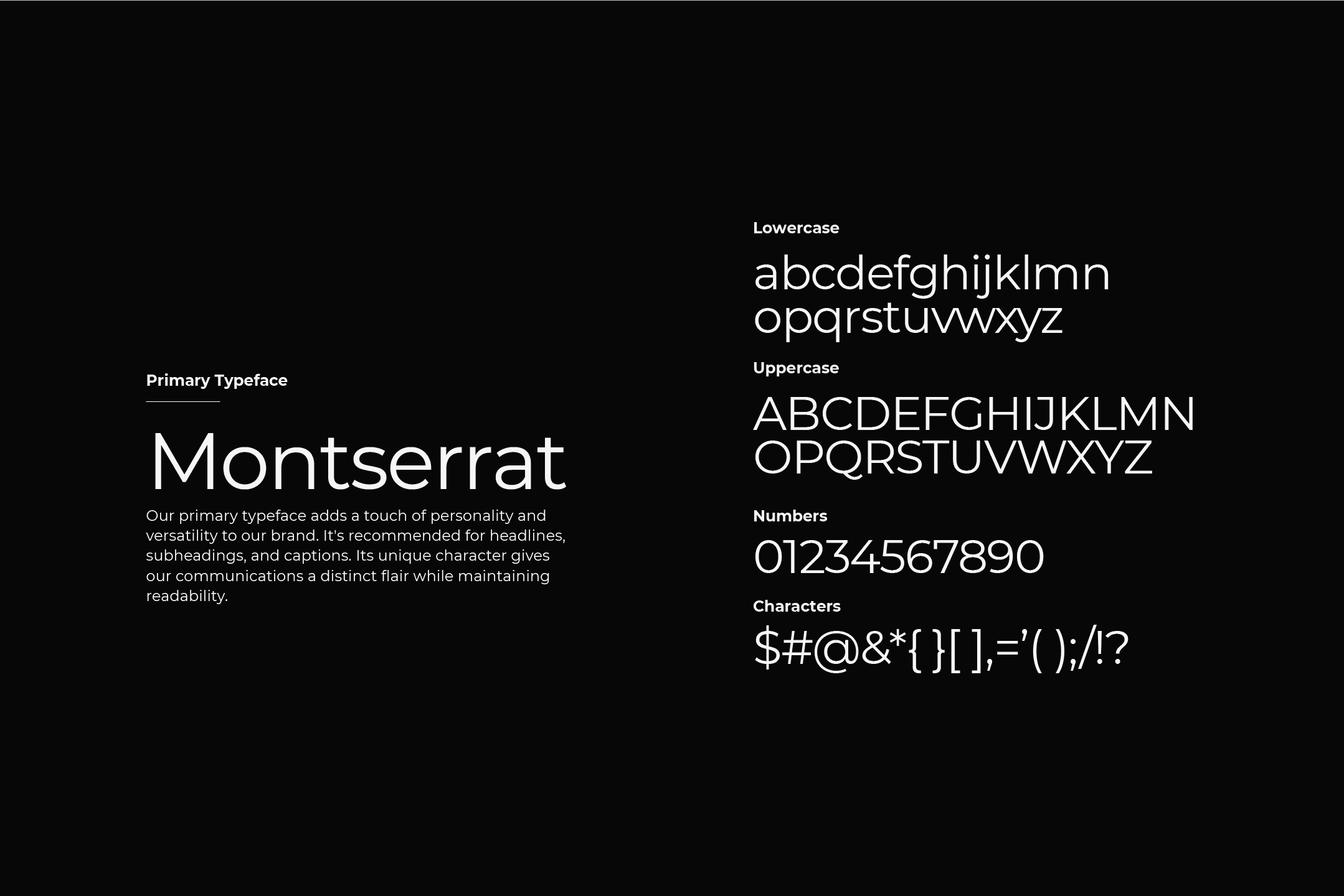
TIPOGRAPHY
TIPOGRAPHY
TIPOGRAPHY


CORPORATE SH1T
CORPORATE SH1T
CORPORATE SH1T


WEBSITE
WEBSITE
WEBSITE
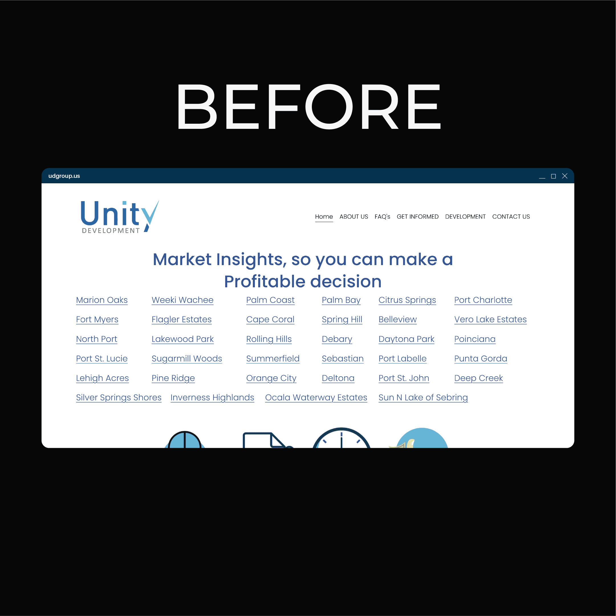
One of the first things I audited was the website and I’ll be honest: it wasn’t just outdated, it was completely unfit for purpose.
The messaging didn’t align with our audience’s mindset.
The layout wasn’t conversion-oriented.
There were no clear CTAs, no funnel logic, and absolutely no mobile optimization — despite the fact that 90% of our traffic came from SMS on mobile devices.
It didn’t integrate with our CRM or support any of our campaigns.
There was no point in trying to optimize it. It had to be rebuilt from the ground up.
A NEW DOMAIN
A NEW DOMAIN
A NEW DOMAIN
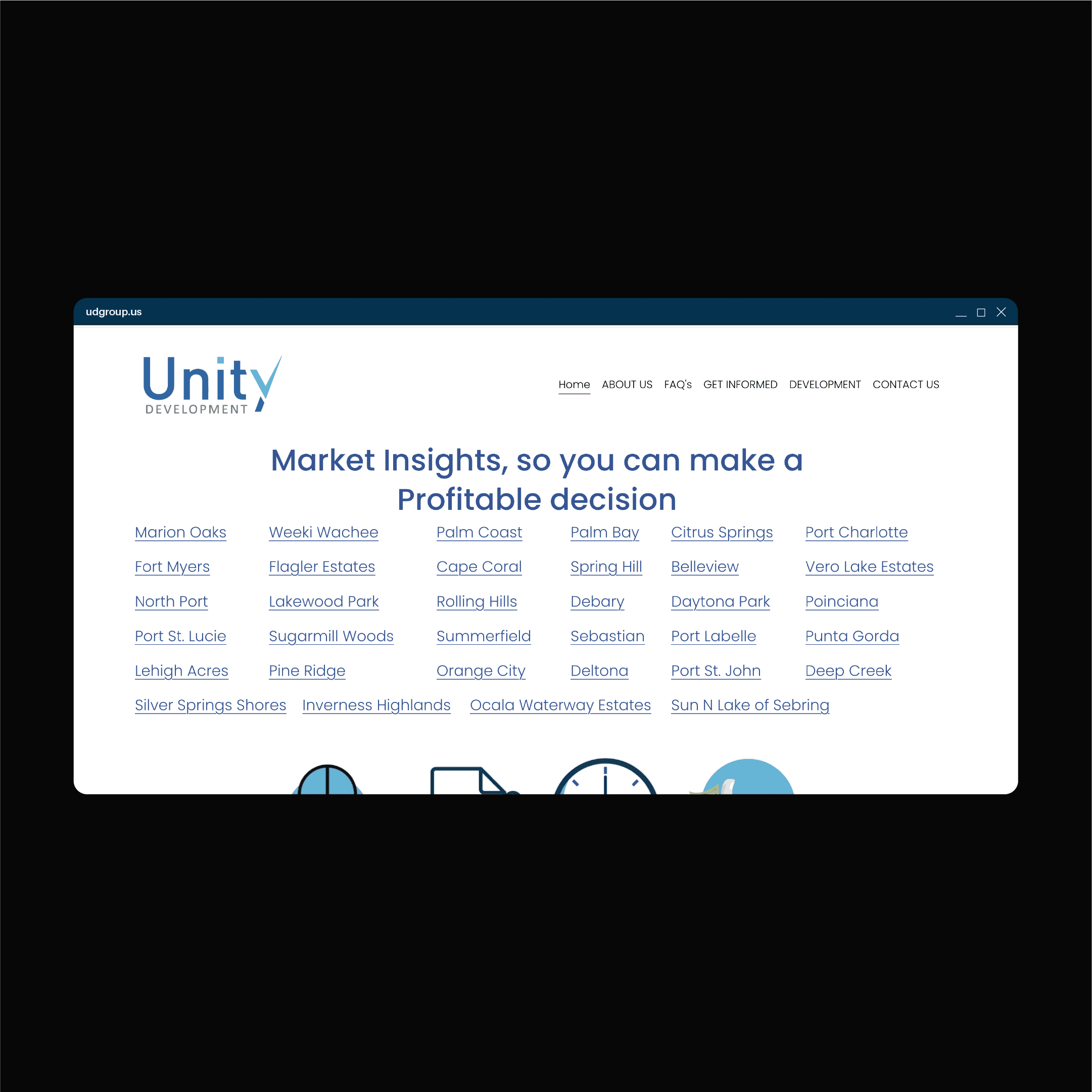
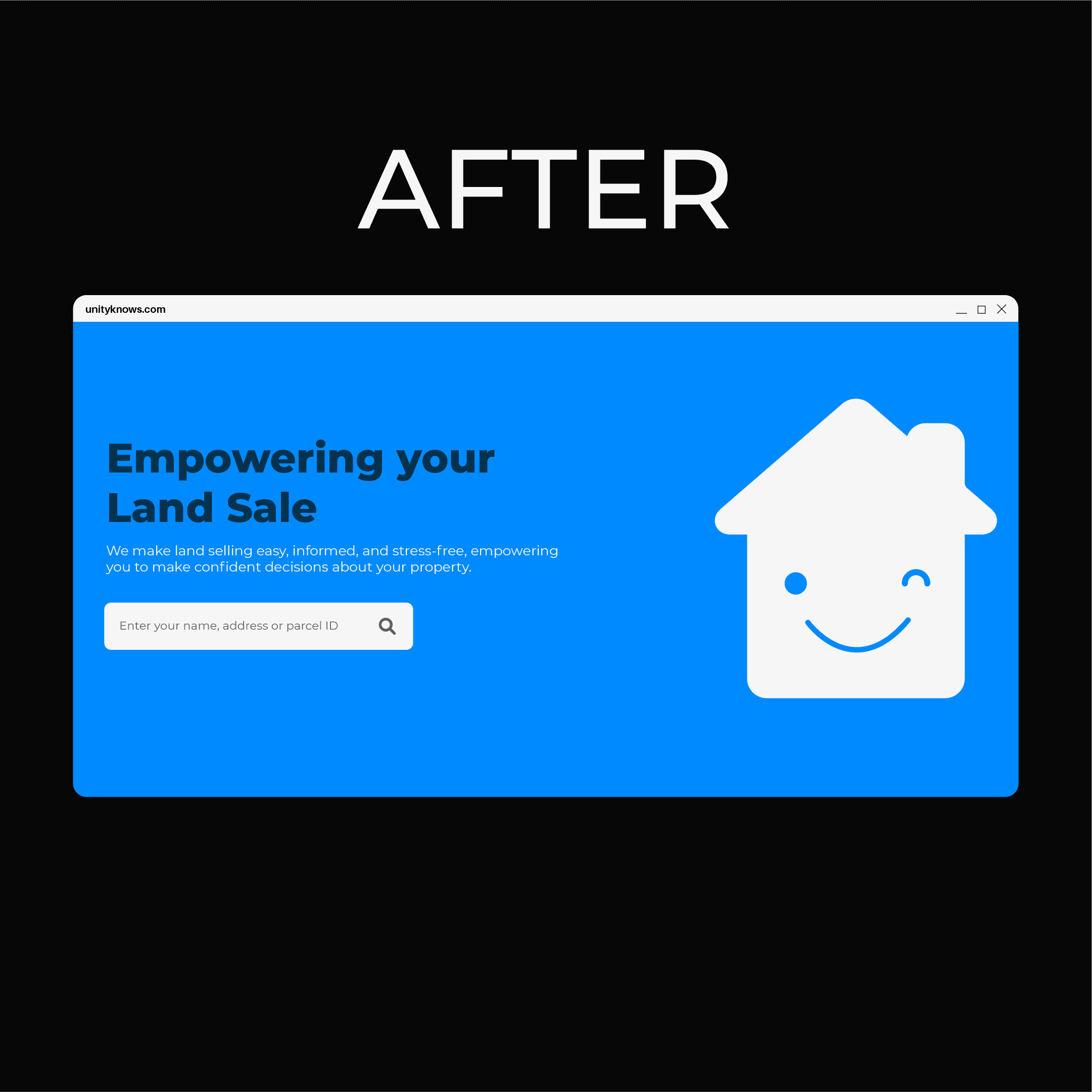
So I made the strategic decision to launch an entirely new website under a new domain: unityknows.com — a name rooted in our positioning: we know what landowners are going through, and we help them make informed, confident decisions.
I rebuilt the entire site from scratch with one goal: turn visitors into leads. I restructured the user journey, designed mobile-first pages, and wrote clear, human copy that built trust fast. I added sticky CTAs, a quiz, and personalized entry points based on traffic source—all connected to HubSpot to trigger automations and track behavior. The result: a website that converts.
This wasn’t just a “better looking” site. It became our primary lead generation engine and the hub for all digital acquisition.
UX/UI: SEARCH BAR 1.0
UX/UI: SEARCH BAR 1.0
UX/UI: SEARCH BAR 1.0
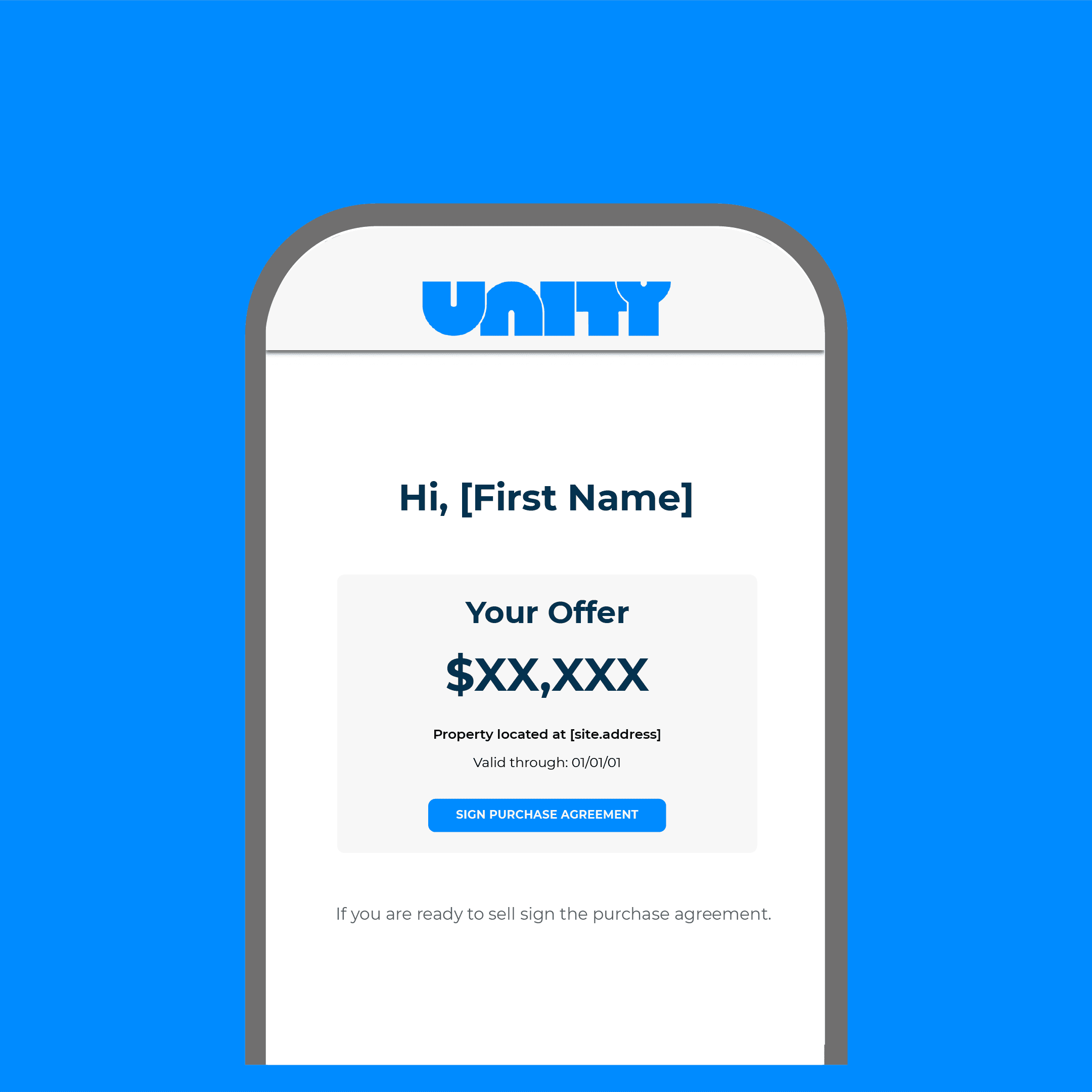
So, UNITY had spent 20 years doing things the old-school way: sending landowners a printed offer and a physical contract by mail. And that worked — but we knew there was a better, more modern, scalable way.
What we wanted was simple:
Give sellers the ability to access their offer online, generate their contract, and sign it — all without talking to anyone. No back-and-forth. No phone calls. Just: get your offer, click a few buttons, done.
That’s where Search Bar 1.0 came in.
We built a system where landowners could land on the website, enter their name, parcel ID, or property address, and get matched to a record in our CRM. From there, they’d go through a short form where they selected their property, answered a few questions, and then — boom — they could view their offer, generate their contract, and sign it online.
It was clean, it was aligned with the brand (straightforward, empowering, no fluff), and it worked well for people who already knew us — especially those we had mailed offers to.

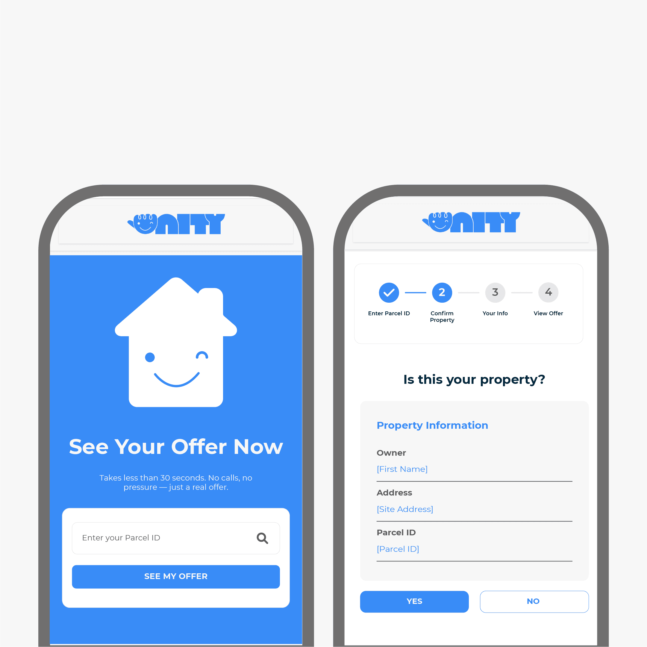
UX/UI: SEARCH BAR 2.0
UX/UI: SEARCH BAR 2.0
UX/UI: SEARCH BAR 2.0
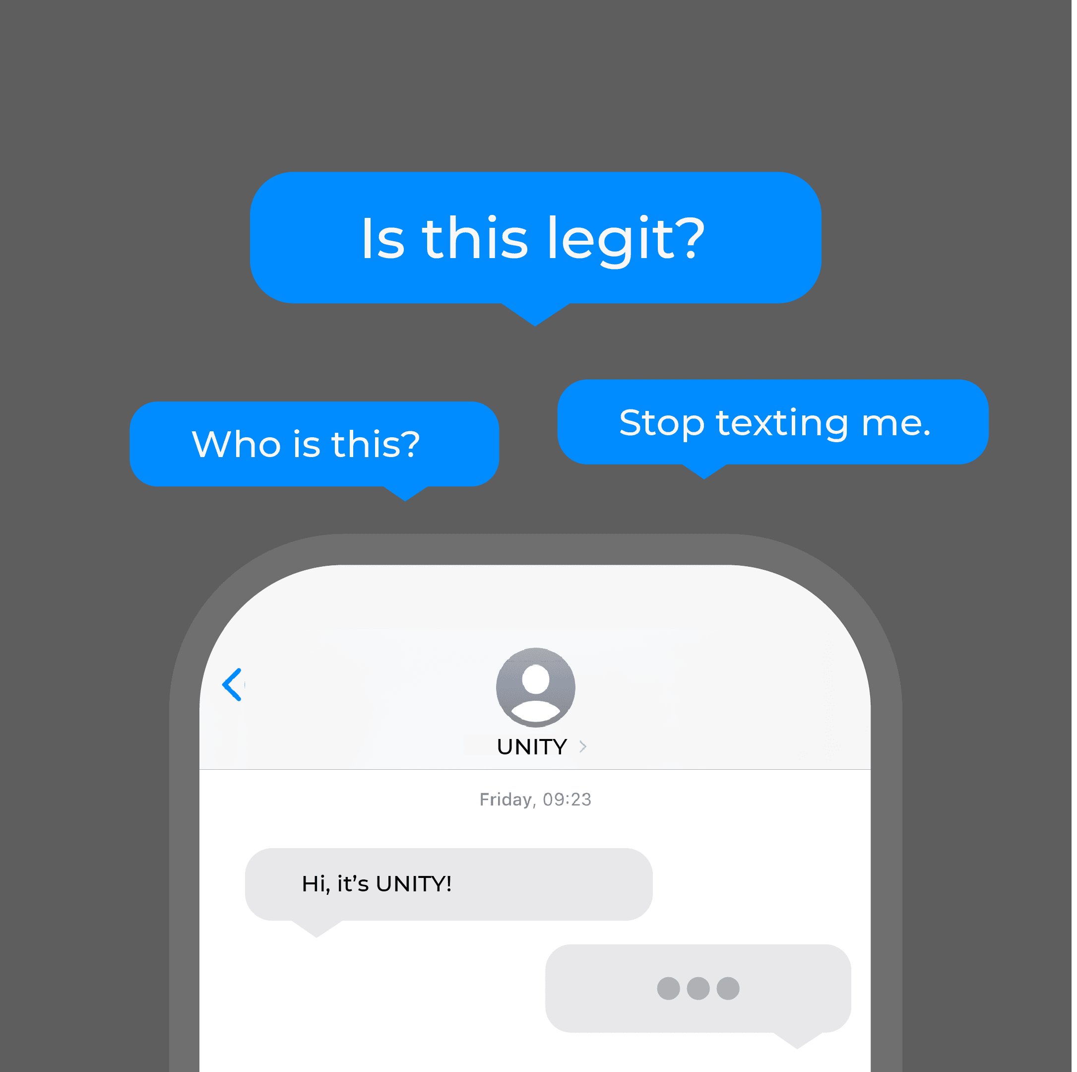
But then we started scaling our SMS campaigns, and that changed everything.
About a year later, we realized that the flow we’d built, while functional, was too long and a bit heavy for the cold leads we were now reaching by text.
We were sending people an SMS with their parcel ID and asking them to “check their offer”, but we were routing them into a form that felt like too much. Too many questions. Too much friction. And it didn’t feel fast or easy anymore.
So we decided to split the journey. That’s when Search Bar 2.0 was born.
This new version wasn’t about generating a contract right away, it was purely about getting people to see their offer as quickly and easily as possible. All they had to do was:
Copy the Parcel ID we sent them in the SMS
Paste it into the search bar
Confirm their property
Enter their name and email
And they’d see their offer in seconds
It was way more lightweight. It matched the tone of our SMS campaigns. And it was built for speed, curiosity, and instant value.
If the offer looked good, then — and only then — we redirected them to the original, longer form (Search Bar 1.0) to generate their contract and sign it online.
So now we had a two-stage system:
2.0 for awareness and speed
1.0 for commitment and closing
This change had a big impact. It improved conversion, reduced drop-offs, and made the entire process feel way more seamless, without sacrificing the automation or legal compliance we had built in from the start.

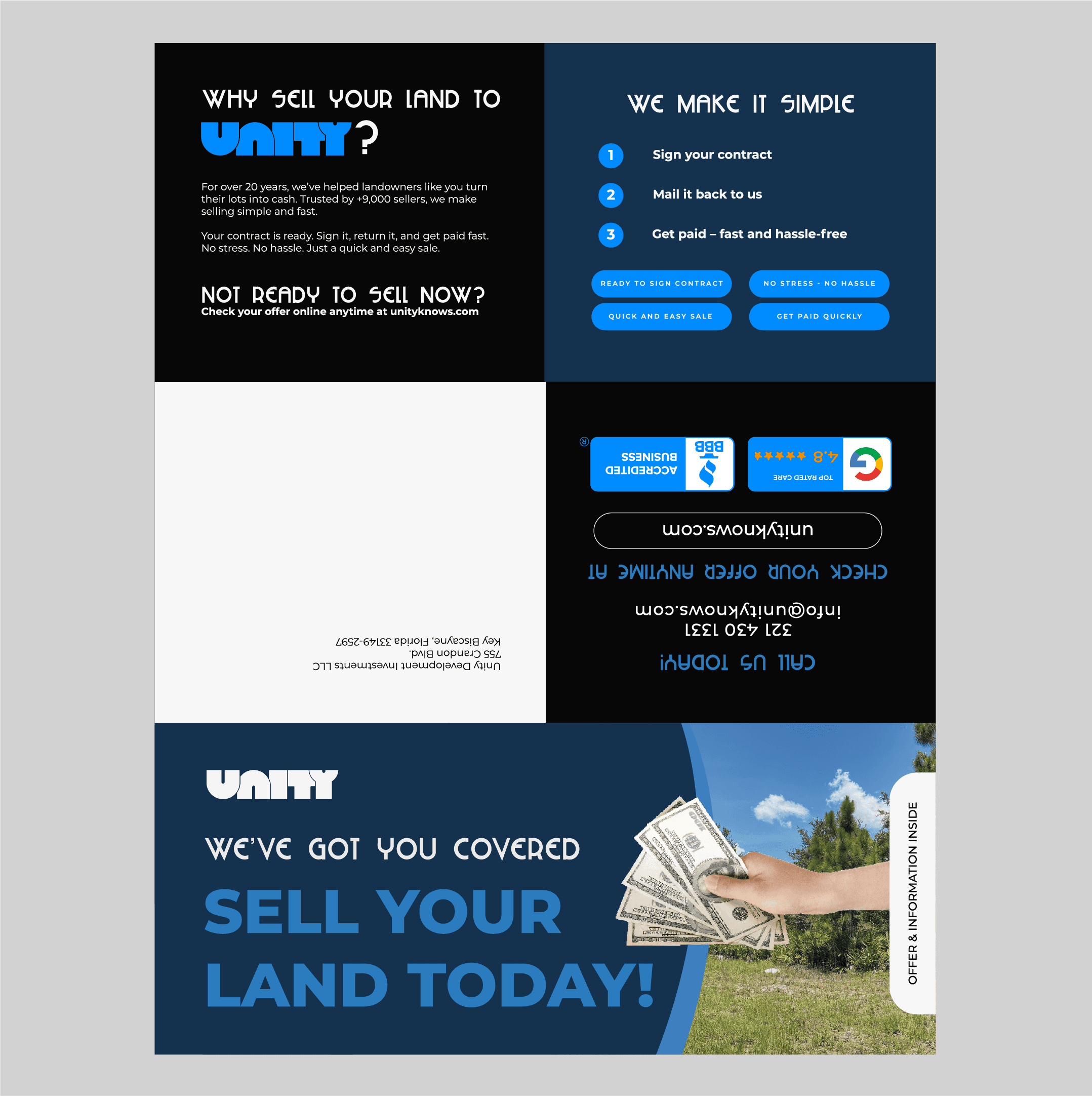
DIRECT MAIL
DIRECT MAIL
DIRECT MAIL
At UNITY, direct mail has always been a core part of the business. For over 20 years, it’s how the company built relationships with landowners — sending out personalized offers and contracts to people across the country. It’s what kept deals coming in year after year.
But when I stepped in, I saw a huge opportunity to modernize and scale that strategy — without losing the reliability that made it work.
So I didn’t throw it out. I evolved it.
I redesigned all the flyers and brochures. I rewrote the messaging, simplified the offer, and made sure everything pointed people online around a clear CTA: “Go to unityknows.com and check your offer.” I even redesigned the contracts to feel more human and easy to complete.
And we weren’t sending a few hundred of these. We run campaigns that reach over 50,000 landowners at a time, with a serious budget behind them. So every word, every pixel, every interaction mattered. These mailers had to work.
And they do, because direct mail is still our #1 lead acquisition channel.
What changed is that now, it’s connected to our digital strategy. Once someone scans a QR code or visits the site, they enter our CRM automatically. They trigger workflows, they get personalized follow-ups, and they move through a funnel that I helped design.
We blended something old and reliable with something new and scalable — and that’s what made the difference. It’s not just mail anymore. It’s a multi-touch conversion system.


SMS
SMS
SMS
Our SMS strategy completely leveled up. I rewrote all the messaging to make it clearer, more emotional, and results-driven, and then introduced MMS with visuals and hooks that actually grabbed attention.
We also improved the landing page experience and launched Search Bar 2.0, which made it easier for people to instantly see their offer. That alone boosted conversions.
But the real breakthrough was the automated workflow I built from scratch. Every SMS reply triggered a smart flow guiding leads to the search bar, updating their status, and qualifying them automatically. It streamlined everything: more leads, less manual work, and a way more efficient acquisition process.


I didn’t just make a new logo or launch a new site. I created a whole experience: A real brand with a mission A clear voice that feels honest A design that feels modern and human A website that gives answers fast A system that makes landowners feel safe It worked because it respected the user. It gave them control. And in the end, that’s all people really want. Make it easy. Make it real. Make it helpful. That’s what I built.
Client
UNITY
Work
Brand Strategy & Digital Ecosystem Strategy
Year
2024
Credits
Malena Torrisi (Creative Director) Ten10Design (Graphic Design Studio)